While we’ve heard broad strokes reporting on the massive levels of debt looming over the US, what about the aggregate indebtedness of our nation’s citizens? We may all know that most Americans are in debt, but we don’t really know how to contextualize the magnitude or what it means. Besides, we have our own mortgages, college tuitions and credit cards to worry about, not to mention the rising prices at the pumps these days.
The sea of debt out there is real – US government debt, corporate debt, and, of course, consumer debt. While it’s good to be focused on doing your share to chip away at your personal debt iceberg, it also pays to consider the issue in a broader sense. After all, redlining the national debt engine will make it crack, and then we’ll all be left stranded, so to speak.
Recently, I dove into the numbers behind the wall of American debt with the goal of providing more context. Of course, with any debt, what matters most is the borrower’s ability to pay it back, whether it be an individual, a business or a government.
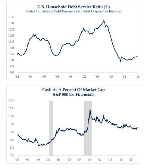
So, I first took a look at the US Household Debt Service Ratio (the Ratio). This number is essentially a tally of household debt payments relative to households’ disposable income. Back in 1994, the Ratio was at about 10.5%. We took on more and more debt as the economy expanded in the lead up to the financial crisis – up and up to almost 13.5%. That’s redline territory.

Luckily, we’re not there today. Since 2009, the Ratio fell to 12 and then to 11 and then to 10, where it continues to hover today.
What this means is that the Ratio is pretty low right now. That means lower stress for American families, and it means that both consumers and corporations have their acts together relative to the federal government.
Still, there’s always room for improvement, and a little would go a long way here. Hold that thought as we wait to see if more tax revenue from a stronger economy will help in the debt cause. But, don’t hold your breath.

